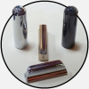
The "close" one above is nowhere near, unfortunately. Almost 40 years in advertising tells me it is probably not a specific font at all; more likely a hand drawn design which I guess was made into an inlay. That was the the way they did things back then, all by hand.
If you can get a sharp image straight up, there are ways to search for a match.
Per Berner wrote:The "close" one above is nowhere near, unfortunately. Almost 40 years in advertising tells me it is probably not a specific font at all; more likely a hand drawn design which I guess was made into an inlay. That was the the way they did things back then, all by hand.
If you can get a sharp image straight up, there are ways to search for a match.
Any fonts you can suggest? The one I presented is called Speeday by the way.
No, no, no. That's like saying Garamond and Times are the same, or Helvetica and Arial. These would require so much tweaking that it is less work starting from scratch.
A visual search using the image yields nothing usable, and from the image you can tell it's hand made, not a font.
Sorry, still nowhere near. Look at the P, the S, the D, the W, the difference in thickness of vertical and horizontal lines. Please believe a typography pro, THIS IS HAND DRAWN, NOT A FONT.
Maybe you can make yourself believe that your Chevy is a Cadillac, but that doesn't make it true – and everyone else will know.
Certainly, if you see something that pleases you, that gets you in the ballpark of where you want to be, that's all that matters. But I agree with Per 100%. There are some superficial similarities between Speedy's logo and some of the letters of the fonts referenced here (and some that I found in a search). But the differences are large.
Jon Light wrote:Certainly, if you see something that pleases you, that gets you in the ballpark of where you want to be, that's all that matters. But I agree with Per 100%. There are some superficial similarities between Speedy's logo and some of the letters of the fonts referenced here (and some that I found in a search). But the differences are large.
Yeah this is for a fun hobby project not a profession and is certainly not a dogmatic pursuit of perfection. The original was hand-painted so I am only trying to approximate it.
Per Berner wrote:The "close" one above is nowhere near, unfortunately. Almost 40 years in advertising tells me it is probably not a specific font at all; more likely a hand drawn design...
I agree, Per. The kerning is different, and the differences in the two "S" characters in the original is the indicator of something irregular and hand-drawn.
Still, I'm just trying to help. Can you do better?
Back in those days, the only "fonts" were professional typesetting used for printed material... ink on paper. This is hand lettering, and most likely done by Paul Bigsby himself.
At least it's not Comic Sans. Horrors!
I also agree with David Ellison's assessment: hand lettered most likely.
E9 INSTRUCTION If you want to have an ongoing discussion, please email me, don't use the Forum messaging which I detest! steelguitarlessons@earthlink.net
I know what it reminds me of. Not the same either.
Rejoice in the Lord, O ye righteous; praise is meet for the upright. Give praise to the Lord with the harp, chant unto Him with the ten-stringed psaltery. Sing unto Him a new song, chant well unto Him with jubilation. For the word of the Lord is true, and all His works are in faithfulness. The Lord loveth mercy and judgement; the earth is full of the mercy of the Lord.
- Psalm 33:1-5


 If you want to have an ongoing discussion, please email me, don't use the Forum messaging which I detest! steelguitarlessons@earthlink.net